

published on 07.12.2025
Over the past few years CafeStube has been changing a lot. From completely rewriting our network to introducing a resource pack, we’ve constantly pushed ourselves to create the experiences we’ve always imagined.
One thing that was consistent throughout our story, however, was our logo. Efforts to change it went back to the original network that we have since shut down, but those efforts were left unfinished.
Whilst our old logo holds sentimental value to all of us, it was actually a band-aid solution taken from our old social-media banner:
We also never had a true high-resolution version of it, so we finally decided it was time to finish what we started and create a new identity for CafeStube.
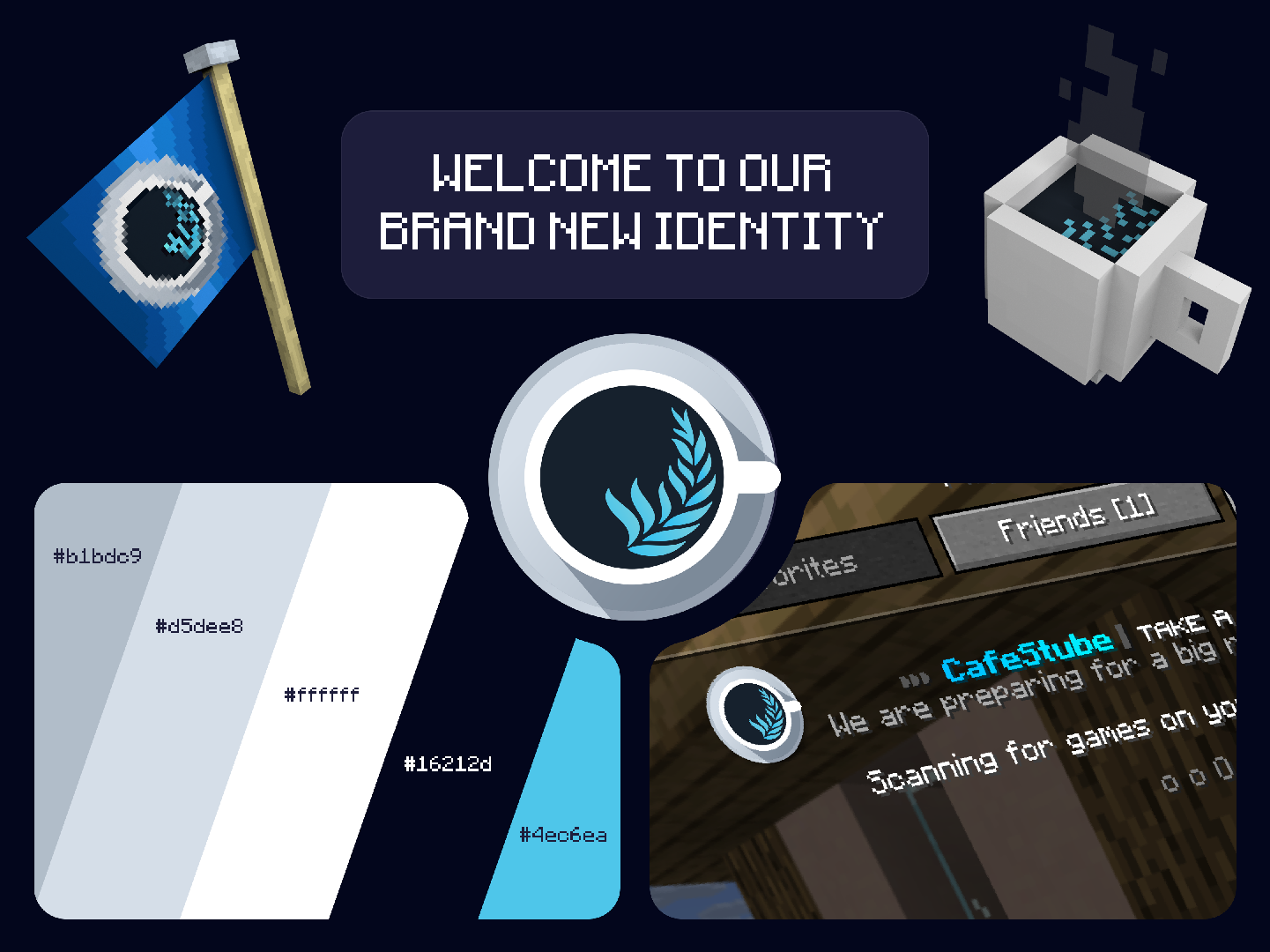
We’re happy to present our new logo! This time, we focused on a more simplistic design and something that incorporated our name better. We hope you like it as much as we do!
Some of you may have already noticed that our prefix colors in the maintenance lobby have changed to blue. Our old yellow/orange look was chosen for its energetic and attention-grabbing psychological effects, but it never fully matched our logo or aligned with our concept. CafeStube is meant to be a virtual place where you take a coffee, play some games, and relax with friends. That’s exactly what our new color scheme aims to convey.
We’ve also heard your feedback about our domain name. Many people were confused by “cafestu.be” and ended up typing “cafestube.be,” “cafestube.de,” or “cafestube.net” instead.
So we’re happy to announce that we are moving to our new domain: cafestube.net. Over the coming months leading up to our release, we’ll be transitioning everything to the new address. The network will still be reachable under “cafestu.be,” but it will no longer appear in any marketing materials.
With our new identity in place, we’re now ready to share exciting sneak peeks and devlogs in the weeks ahead.
Stay tuned!
Follow us on